
This traditional local optician needed a corporate design update without completely changing the well-known logo and colours.
ART DIRECTION 2020-2022BRANDINGOptik Kalthoff

Social Media
•
Corporate Identity
•
Store Design
•
Social Media • Corporate Identity • Store Design •

The new key visual uses abstracted forms of different models of glasses. The forms can be coloured either in the three main brown tones or in the six supporting pastel colours or used as outlines. These combined shapes can then be overlapped to be used as a base for texts or as aesthetic visuals.


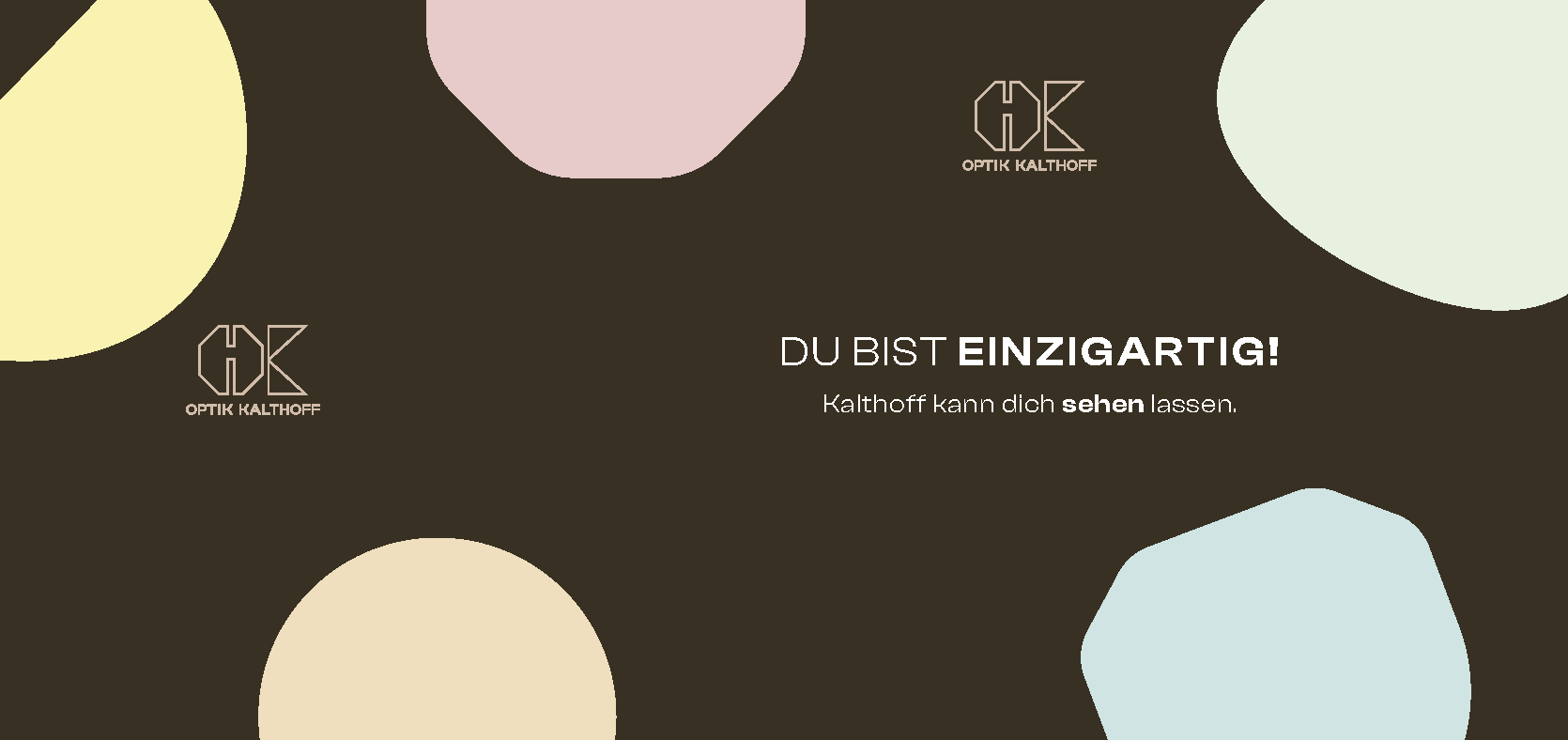
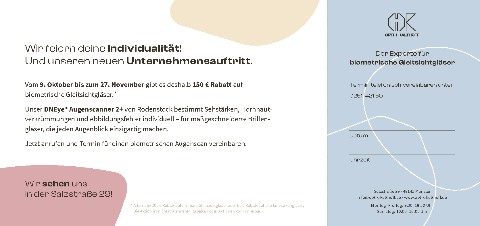
Additionally to updating the logo, a new combination of fonts was added update the corporate identity: Clash Display for headlines and the Source Sans Pro for texts.
The new branding includes several print media, business equipment, advertisements and store interior design among other things.


Design & Art Direction: Julia PoeppelMann
While working at Living Concept Werbeagentur